Creating Harmonious
Kitchen Color Schemes
Successful kitchen color schemes are a result of careful planning and proper selection of different finishes (flooring, cabinets, countertops, tile, and of course wall paint color). Read on to learn some insider secrets for choosing the best kitchen colors for a harmonious design...
Creating Kitchen Color Schemes
from Scratch
If you're starting from scratch and creating a totally new kitchen color scheme, the question is, where do you begin?
Since they are more limited in variety than paint colors, my suggestion is to start with hard finishes first - that would be your countertop, flooring, backsplash and cabinet colors.
Finding Kitchen Color Scheme Starters
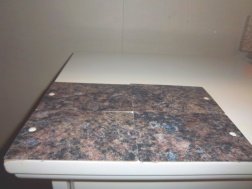
Keep in mind that when selecting a color (both for hard finishes and for your walls), larger sample pieces are always a big plus.
The small little chips you get in most stores make it very difficult to determine a color - that's mostly because your eye can't help but be distracted by everything around it.
So don't be afraid to surreptitiously take a couple of those chips from the store to get a better sized sample piece.
Colors also change at different angles. That blue you see when you hold the sample straight up? It might look green when you lay it down, or even be imperceivable.
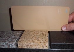
Have you ever noticed how the same wall paint color looks different in a different room? That's because the light is different, so if you're trying to pick a color, always look at it the way it will be seen, that means on a countertop and floor - flat, on a wall, backsplash and cabinets - perpendicular.
This is one of the most common mistakes people make - holding finish samples in their hands and trying to match colors.
Instead, position each sample on the right plane (vertically or horizontally) - that will give you a much clearer idea of how colors will look on a completed project.

Another tip is, when you look at counters and flooring, try to look at them on an angle; lay your sample flat and look at it from the side - because that's how you ultimately see your counter and your floor, that's how the light will hit them.
So place that flooring sample on the floor, backsplash sample against the wall, and your counter piece flat at about waist level and step back. You should get an idea of how dark, or how colorful your kitchen color scheme is going to look, and even how certain colors blend to create an overall color.
A word about that beautiful dark granite you just love: it's going to be a big dark expanse. That's not good or bad, just dark. Maybe you want it dark, and that's okay.
This brings me indirectly to my next point... balance. By this I mean a balance of color and a balance of value (light and dark properties of color). Balance is a very important element because it's what makes a room more pleasant to be in.
Balancing Your Kitchen Color Scheme

In a room like a kitchen, which is usually a pretty active place, balance involves avoiding high contrasts - strong lights and darks.
For example, if you have white cabinets, counters and appliances, and paint your walls red, that's high energy, high contrast, maybe even a little tension.
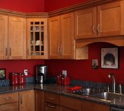
If you had a darker counter, with a reddish tone, and stainless steel appliances, maybe a wood floor, those dark red walls wouldn't stand out quite as much (and if you had wood cabinets that picked up some of the red in your paint, that would be even better).
Even though the colors would be different in this case, the contrast would not be extreme.
So the rule of thumb is, the closer the colors of your walls, trim, floors and countertop are to one another, the more calming your kitchen color scheme will be, and vice versa.
Pulling Your Kitchen Color Scheme Together
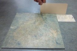
When you've got your counter, cabinets, backsplash and floor tile selected and you're looking for a wall color, try to pick out an overall color from your hard finishes that you can then apply to the walls.
I know this sounds crazy, but squint! Sometimes blurring your vision a little will actually help find an overall color, because your focus will be off and you will be forced to look at an overall color.
Look at your countertop and try to see a predominant color. Don't look for some little fleck that you can only see at certain angles, but a color that stands out. If there is a color in there that you really like and would like to notice more, bring it out with smaller doses of its complement.
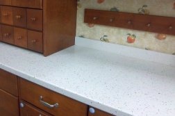
The complementary colors are the ones opposite each other on the color wheel: for example, red/green, blue/orange and yellow/purple. The rule on complementary colors is, next to each other, they bring each other "out", so a red will look redder next to green, a blue will intensify an orange color, and so on.
By smaller doses, I mean accessories, towels, rug, placemats - but not wall color!
If you try to use a complement on the walls, it can look "off", because the amount of color you're trying to complement is small - the eye doesn't see that small amount of color until you're right on top of it, and that's not how the colors of a room are viewed.
Updating Old
Kitchen Color Schemes
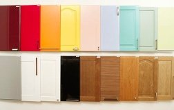
The same "rules" (although I hate that word) apply if you are just updating your kitchen color scheme.
Start with the elements that are not changing - like your cabinets, the countertop, or the flooring.
And although most surfaces can be painted (cabinets, countertops and even wall tile), it's totally up to you to decide.
Just remember that any kind of painted surface will chip eventually, but if you're just trying to stretch your kitchen dollar, maybe you don't mind living with touching up from time to time.
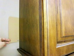
For example, years ago my sister moved into a 60's kind of house. The kitchen was dark with oak cabinets and beige tile counter top.
Just moving in was not the time to blow up a kichen, so I painted the beveled doors and drawers of her cabinets three shades of white (the darkest shade was in the actual bevel, and the walls and trim were the lightest of the three colors).
This color scheme brightened up the kitchen immensely and lasted until it was time to redo.
You can always easily stretch the life of any room and update its color scheme just with paint alone; even surrounding your existing old countertop and your dated cabinets with a new wall color can totally change how they look.
Paint is easily the most bang for the buck, and by paying attention to an overall color when you get started, you can approach projects one at a time.


