Need a Recommendation for My Kitchen Paint Colors
by Anonymous
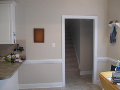
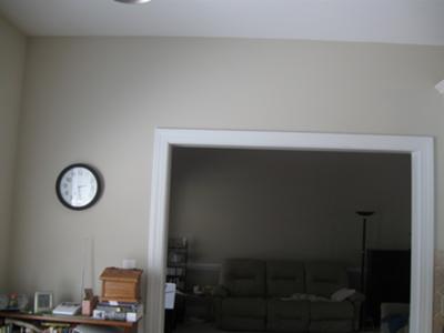
Kitchen leading into the short hallway
Dilemma:
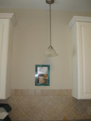
I'm looking to cover the walls of my kitchen - preferably with a green paint color. However, I am open to other color ideas.My kitchen cabinets are creamy white, and I have 4*4 Rialto beige tiles that were bought at Lowe's.
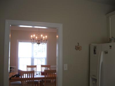
The room at night can get pretty dark. I have one overhead light in the main cooking area, with one pendant light over the sink. The "eat in" area has one chandelier.
The mirror above the sink doesn't need to stay after I paint (it's just there until I find a better item). The hanging light is slightly off center, so it makes it a little hard to find a matching decor item to fit.
It is a very open layout. The kitchen leads into the dining room and living room.
I have enjoyed the builder's beige, but now I want something a little different since the builder's beige is on all walls throughout the house.
Critique:
Dear Anonymous, greens are usually a great choice for a kitchen. And in your case, you even have a green-ish countertop that we could match the wall paint color to and call it done... right?Wrong, and here's why:
Your backsplash tile is beige but has a red (or pink) undertone, and red and green intensify each other when used together. This means that any green next to your pinkish tile will make it look even pinker - and it's easy to see how your greenish countertop is already doing that.
Now, if you paint all the kitchen walls green, the mismatch between your backsplash/countertop finishes will become even more obvious, and in addition your hallway carpet will start looking pinker as well:
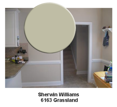
So what would be a better option? A dusty blue, something like Krypton from Sherwin Williams:
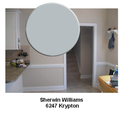
See how it calms and de-emphasises the red in the tile and carpet, and instead connects to the floor and even countertop that also have blue-gray tones in them?
The result is a more harmonious and color-coordinated space, and a better relationship between all the different finishes in your kitchen.
And finally, regarding your dilemma decorating around the mis-aligned light above your sink - instead of using a single object, try something asymmetrical or consisting of 3 items, like this:
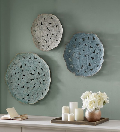
That's the best way to distract from your off-center light, visually correct the imbalance and make the whole design look more intentional.
